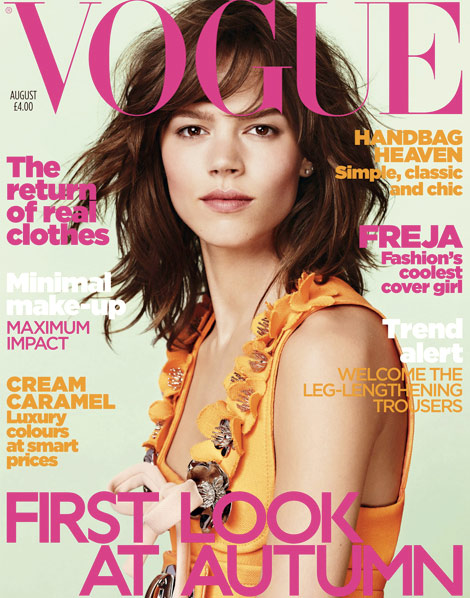
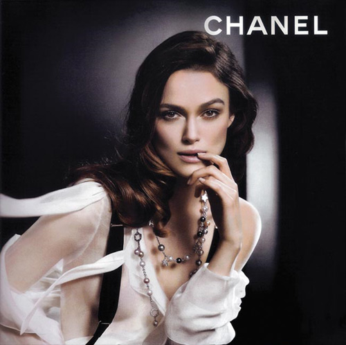
Semiotics is a philosophical theory of the functions of signs and symbols. Semiotics is used to identify the underlying meaning. Elements of visual texts work together to produce a meaning.
For example road signs are a visual art that have a common meaning.
An image can also act as a cue e.g.
The 'golden arches' are a global symbol for food chain McDonalds.
Words can also have the same effect. The word coward, for example, makes you think of the relative and opposite so along with coward you would think of bravery. Words can have several connotations and therefore meanings.
The clothes we wear may also have a meaning, they can describe who we are or make a statement. They can show conscious and unconscious thoughts; we might have worn something because it looks good or because it is comfortable.
Clothing label French Connection, for instance, began branding their clothes in 2001 with 'fcuk' an acronym for French Connection United Kingdom, but it also controversial, shocking people and very eye-catching:
Words have denotations and connotations.
Denotation: the literal meaning, what it actually is.
Connotation: other suggested meanings.
Such as a rose is a rose. However a red rose suggests romance and valentines and the rose wilting would suggest the love was dead. These positive associations are dominant ideologies, like the rose suggests what romance should be about. For instance red, pink and 'love hearts' are associated with Valentines Day and snow is associated with Christmas.
There are 3 basic types of sign and code:
Iconic: they appear exactly like the thing itself, e.g a cowboy with a hat, gun and spurs etc:
The iconic sign acts to represent more such as the cowboy being associated with bravery. These reinforce ideologies e.g. the cowboy represents masculinity.
Indexical: they indirectly suggest what they mean, these act as a cue to existing knowledge such as:
Smoke - fire
Sweat - nervous
- Apple Inc.
Symbolic codes: act as signifiers of meaning, are totally disconnected from what they denote and are often culturally specific.
E.g. Red - love + passion - hearts
White - peace - doves
Conventions are an established way of doing something and, unlike traditions, will change over time.
This is demonstrated in adverts, women are usually portrayed as one of two things:
The sex symbol, used in perfume advertisements e.g.
OR
The domestic goddess, used in fairy liquid adverts e.g.
Wednesday, 29 September 2010
Thursday, 23 September 2010
Designing a front cover.
Now I have been given my brief I will need to start thinking about ideas for a front page.
Usually a designer decides a template for the magazine which is then usually used for 18 months - 2 years, the template stays in place unless the magazine is relaunched or redeveloped.
With the basic look of the magazine determined by the template design it's appearance remains pretty much the same. Colours used each month/week/fortnight will vary especially between seasons. Summer issues favour a brighter more colourful appearance whilst those published during winter months will tend to be darker in colour showing preference to blacks, greys and blues:
In addition to this, magazines can now be printed in two available sizes, the usual A4 and now A5 (also dubbed 'handbag size'). This is something I will consider when designing each of my magazines.
Usually a designer decides a template for the magazine which is then usually used for 18 months - 2 years, the template stays in place unless the magazine is relaunched or redeveloped.
With the basic look of the magazine determined by the template design it's appearance remains pretty much the same. Colours used each month/week/fortnight will vary especially between seasons. Summer issues favour a brighter more colourful appearance whilst those published during winter months will tend to be darker in colour showing preference to blacks, greys and blues:
 | |||||||
| Summer edition |
 |
| Winter Edition |
In addition to this, magazines can now be printed in two available sizes, the usual A4 and now A5 (also dubbed 'handbag size'). This is something I will consider when designing each of my magazines.
My portfolio.
For my foundation portfolio I need to create:
- Front page and contents page for a college magazine
- Front page, contents page and double-page spread for a music magazine
Magazine conventions
The first lesson for AS Media introduced us to magazine conventions. Typical conventions a front cover for a magazine may include are a masthead, headline, mode of address, plugs, teasers, date and issue number, a puff, magazine logo, main image (maybe involving studio shots), price and a barcode.
Magazines can be organized into different genres depending on their audience such as music, fashion, gossip, nature or gardening etc. Magazines vary and their conventions reflect the genre:
Glamour magazine follows typical conventions for a magazine aimed at a female audience. The cover consists of a medium close-up of a female celebrity smiling and with direct eye-line, this draws in the audience and encourages them to buy the magazine. The colours used include pink which attracts females and the monochrome black and white reflect the fashion for this particular season. Also displayed on the cover is the magazines logo and headlines that are features within the magazine (again used to promote the magazine to the reader). This type of magazine will also frequently advertise make-up brands and give away samples.
Unlike Glamour, Q has more than one cover star. The Q cover shows 3 different music artists each from a different music genre, this shows diversity in the music featured within the magazine and appeals to a wider audience. Colours used are simplistic, the black and white keep it uncomplicated and the red draws attention to key features such as the artists featured, the logo and articles inside. Even the cover stars clothing co-ordinates with the look of the magazine, the uniform black maintains the bold imagery. The fact the logo is in the top left corner of the page means there is more head space for cover imagery and it does not look crammed in or too busy.
Subscribe to:
Posts (Atom)


